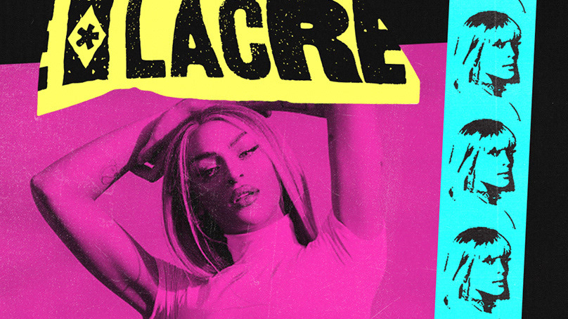
2º FINALISTA NO "EDITAL CONCURSO DE CARTAZES E LOGOTIPOS - CENTENÁRIO DA SEMANA DE ARTE MODERNA DE 1922" PUBLICADO PELO CENTRO CULTURAL DE SÃO PAULO (CCSP)
É inegável o significado da Semana de Arte Moderna de 22. Mesmo com todos seus limites, ela foi responsável por organizar uma narrativa histórica criadora de um novo estado de espírito nacional. A partir do rompimento com os cânones da época, os desdobramentos do evento buscaram desenvolver uma ideia de Brasil, se voltando por uma busca de nossas reais raízes num processo de definição do antes, mas principalmente do além. A semana é lida como o mito de origem do Modernismo, a grande matriz cultural brasileira do século XX que ainda pulsa no imaginário nacional transcendendo os três dias no Teatro Municipal. Revisitá-la durante seu centenário é uma grande oportunidade de mobilizar e reinventar o tempo presente, o nosso passado em aberto e as possibilidades de um futuro que se anuncia.
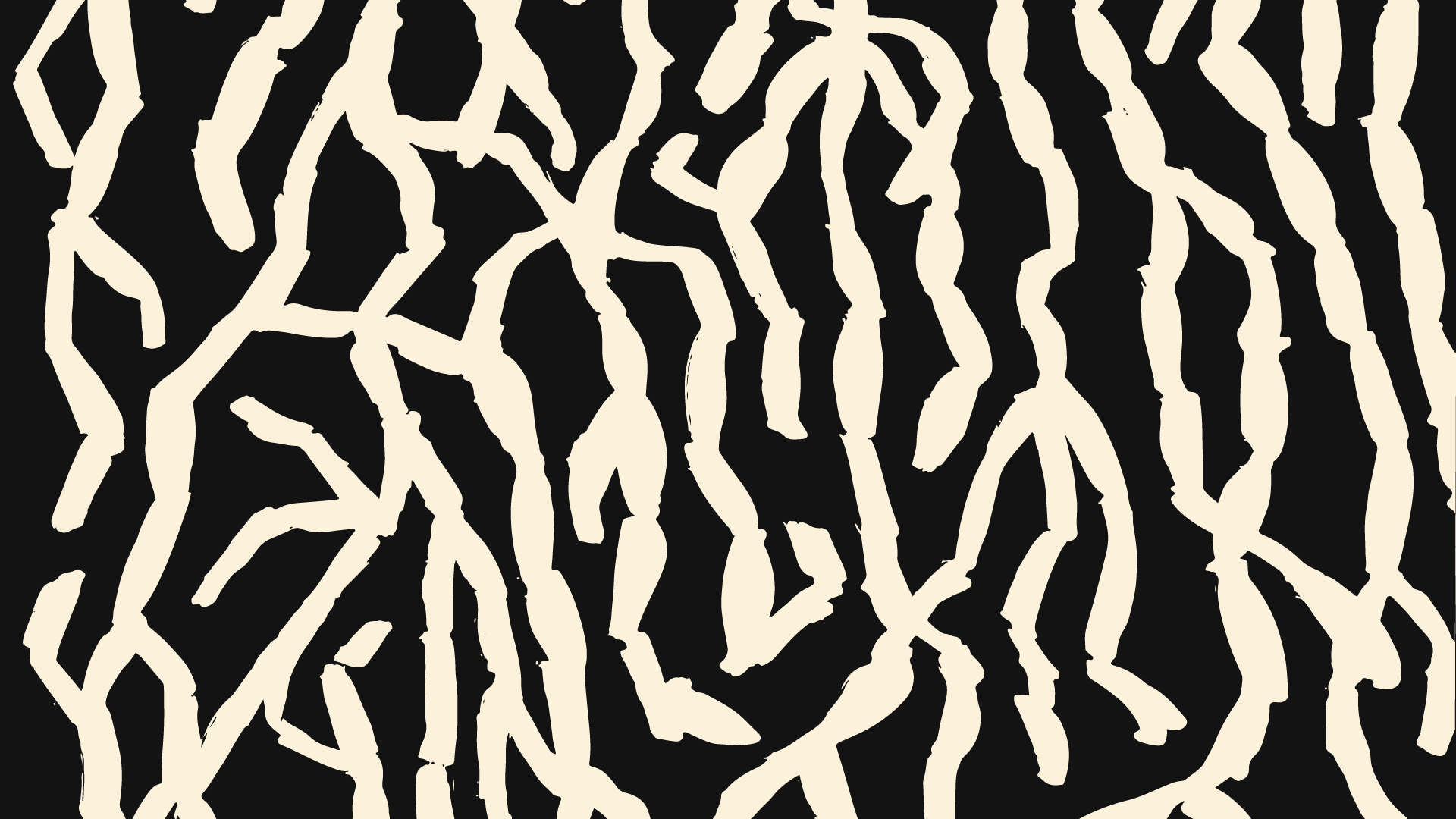
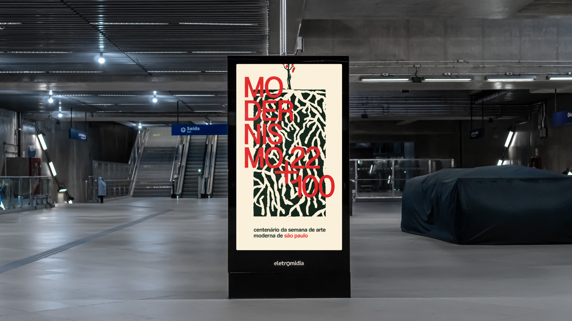
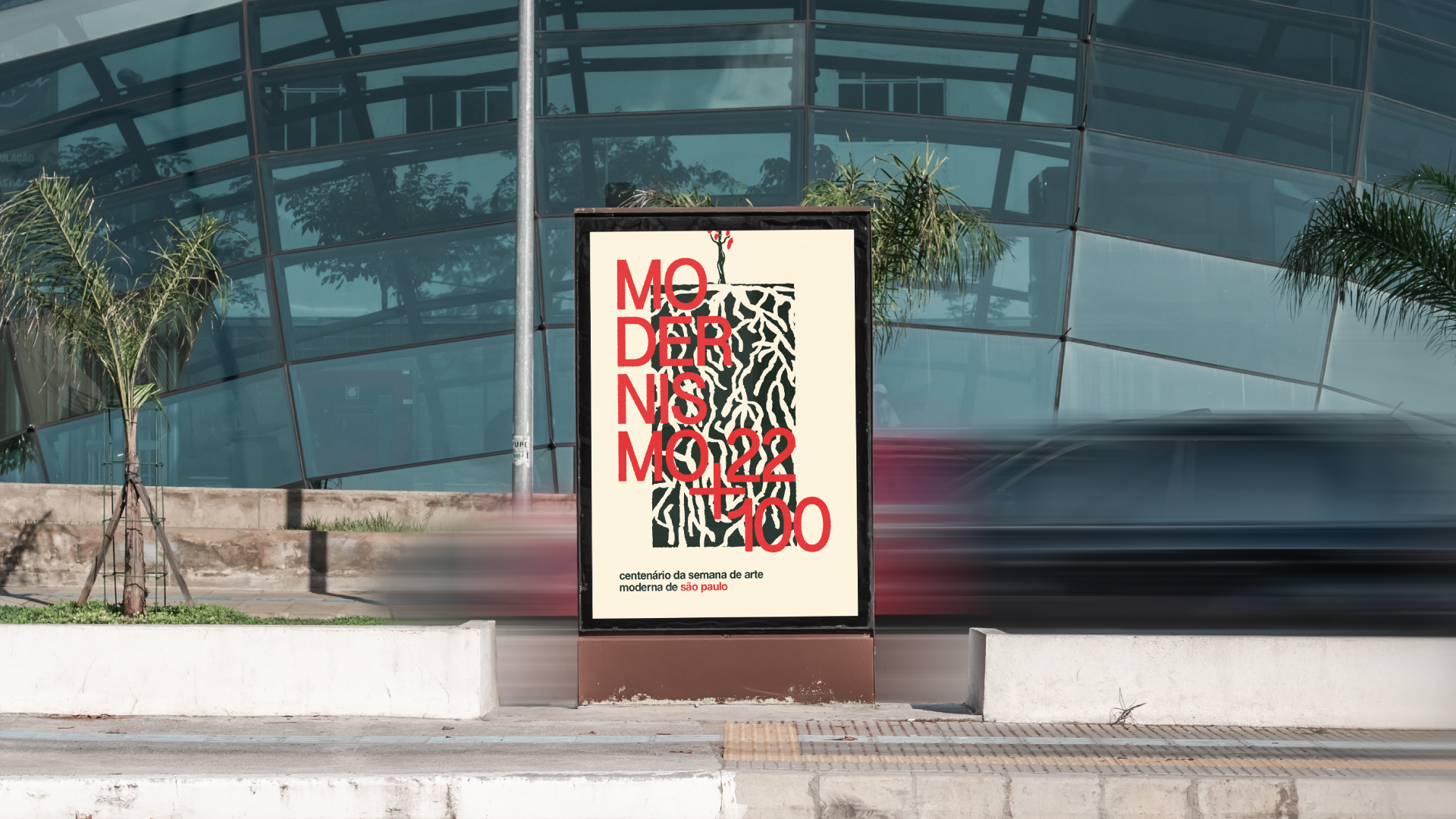
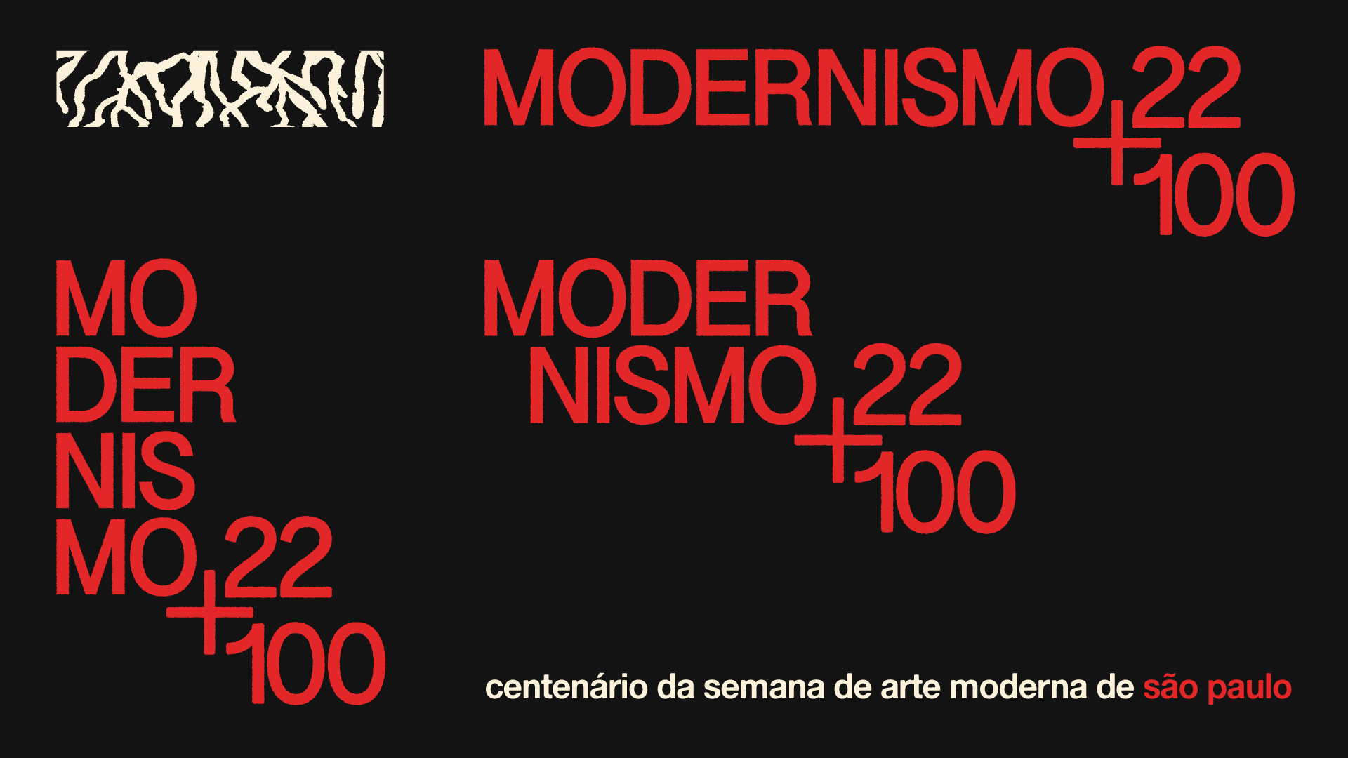
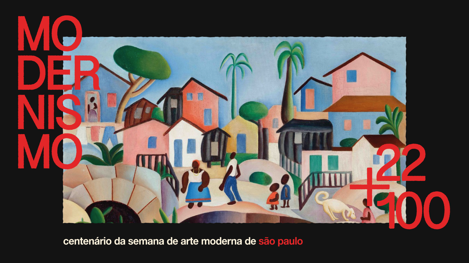
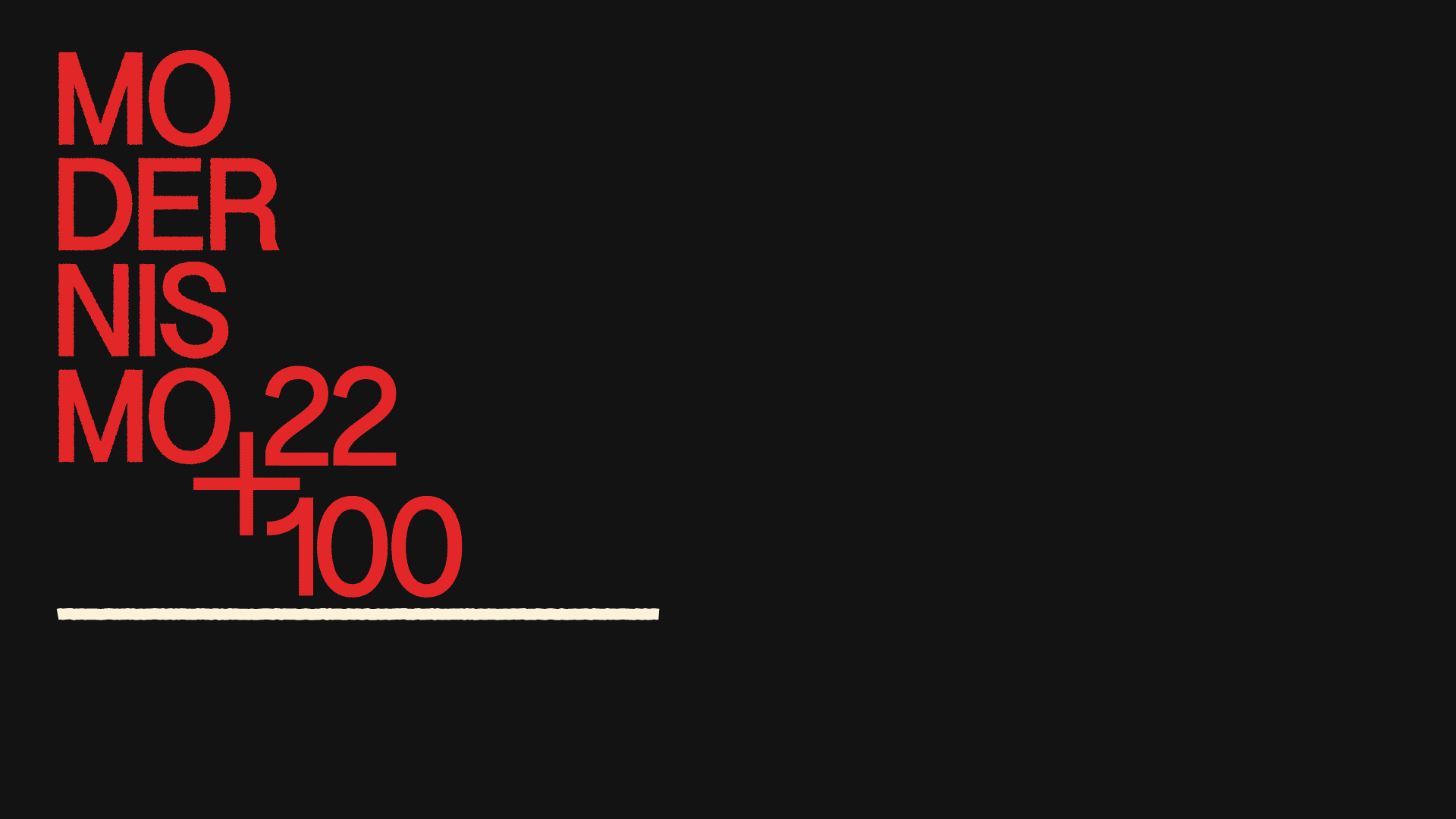
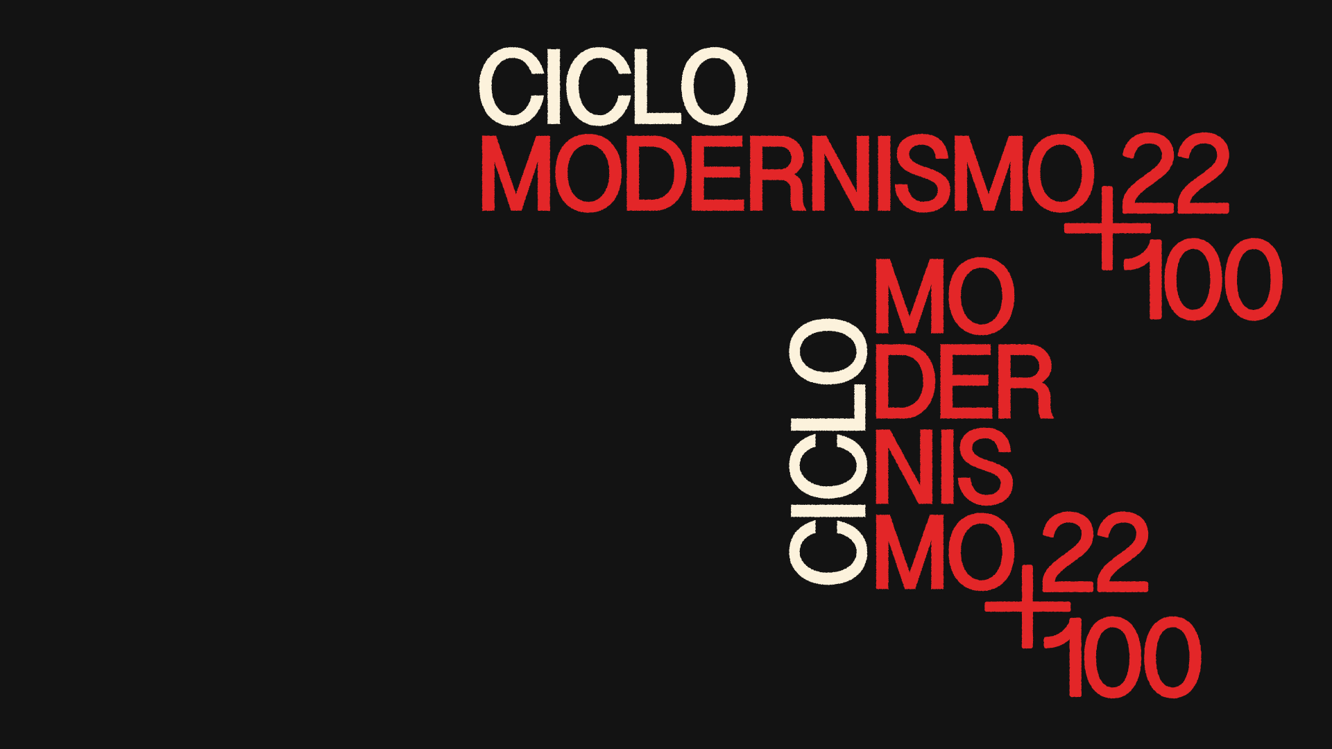
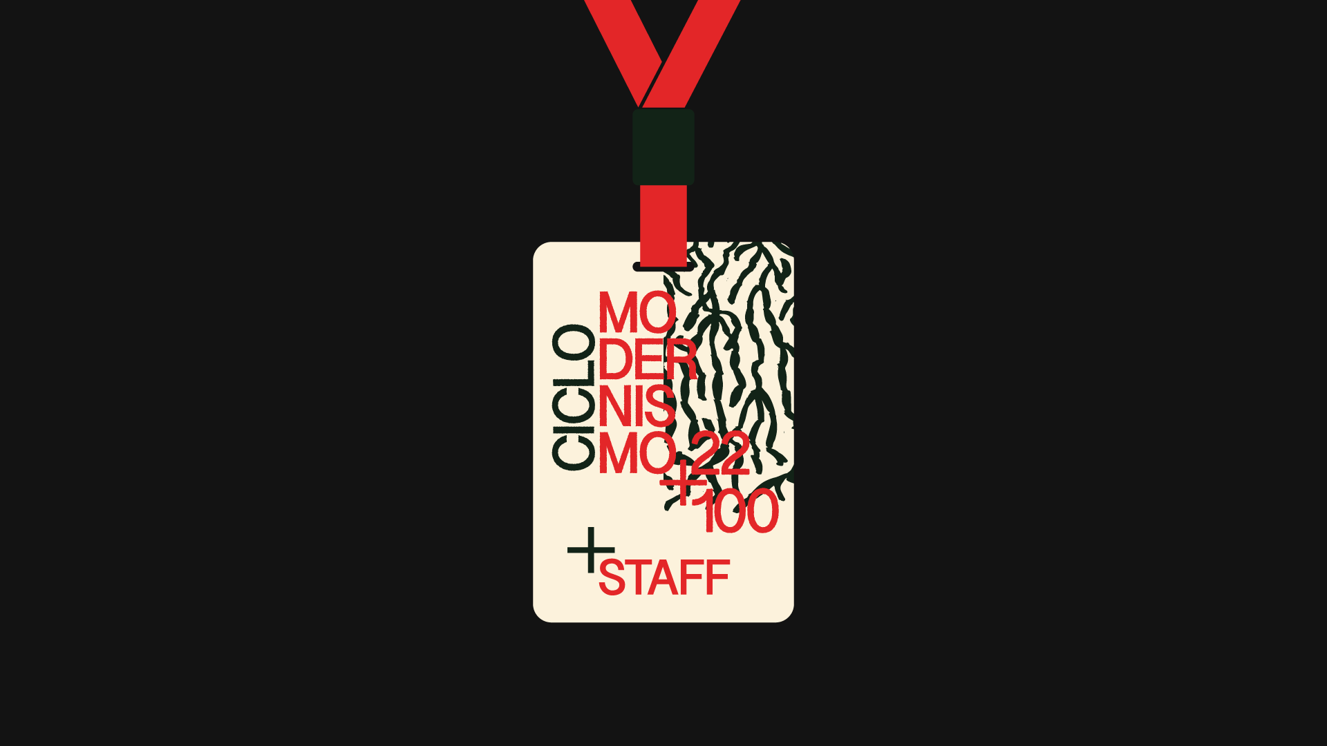
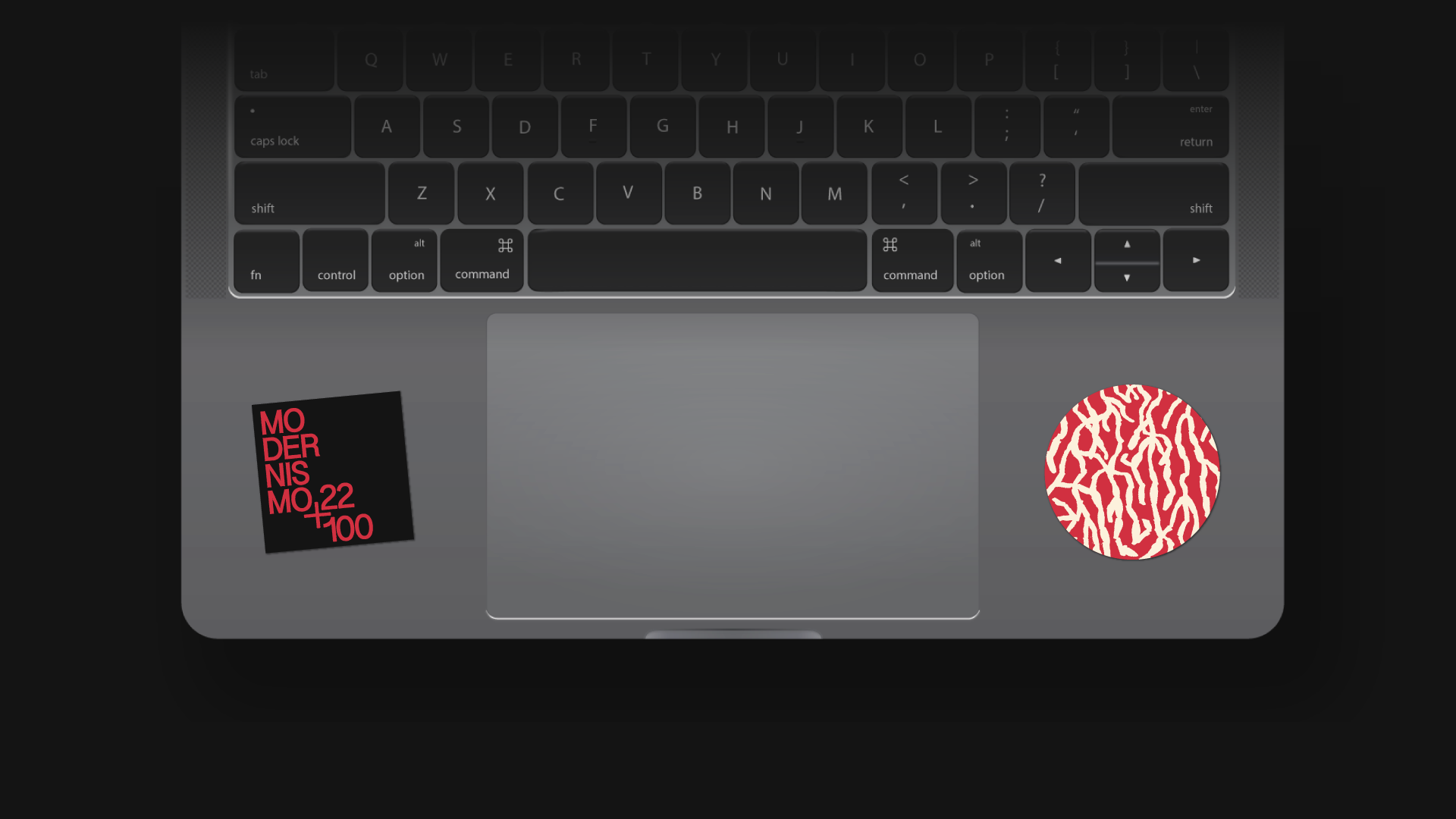
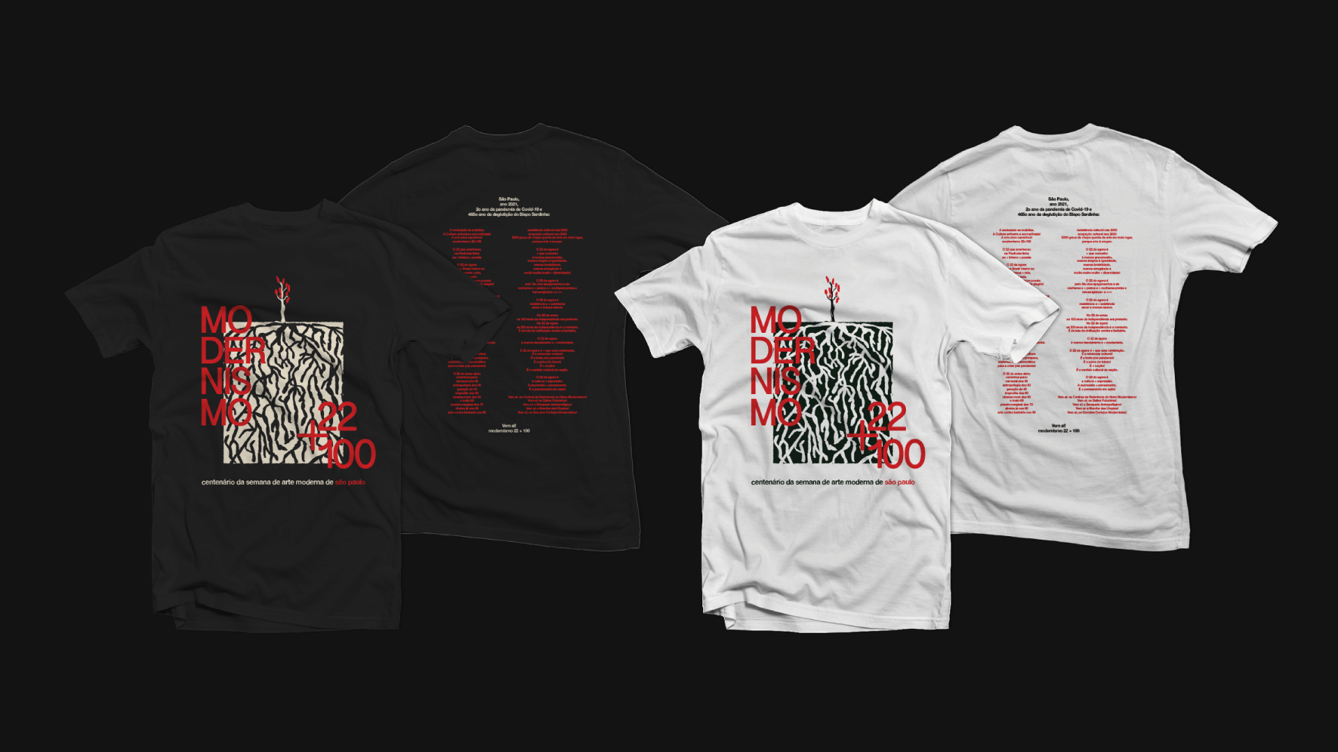
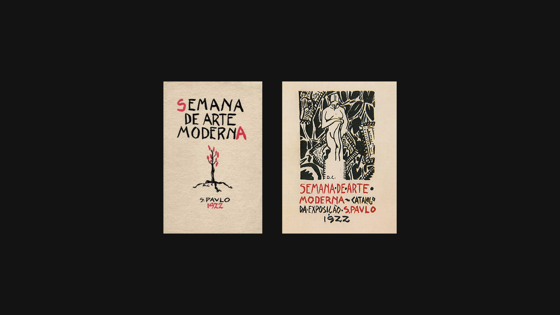
O icônico cartaz produzido por Di Cavalcanti remete à ideia do evento como a materialização de algo muito maior que si mesmo. A pequena árvore com frutos vermelhos pode ser interpretada como a muda de todo um movimento que começa a ser semeado ali. A capa do catálogo e a tipografia criam uma conexão imediata com as xilogravuras e artes brasileiras mais populares, reafirmando os ideais do movimento. A proposta de cartaz e logo se apropria desses elementos e reflete sobre a importância do evento por meio de uma identidade moderna e versátil. Assim como as árvores do cerrado, o porte da pequena árvore do cartaz esconde sua verdadeira dimensão, que é revelada por suas raízes profundas e é onde está sua real importância. Muito mais que florescer, o Modernismo criou raízes.
--
2nd FINALIST IN THE "ANNOUNCEMENT FOR POSTERS AND LOGOTYPES COMPETITION - CENTENARY OF THE 1922 MODERN ART WEEK" PUBLISHED BY THE CENTRO CULTURAL DE SÃO PAULO (CCSP)
The significance of the Modern Art Week of 22 is undeniable. Even with all its limits, it was responsible for organizing a historical narrative that created a new national state of mind. From the break with the canons of the time, the unfolding of the event sought to develop an idea of Brazil, turning to a search for our real roots in a process of defining the before, but mainly the beyond. The week is read as the myth of origin of Modernism, the great Brazilian cultural matrix of the 20th century that still pulsates in the national imagination, transcending the three days at the Municipal Theater. Revisiting it during its centenary is a great opportunity to mobilize and reinvent the present, our open past and the possibilities of a future that announce itself.
The iconic poster by Di Cavalcanti refers to the idea of the event as the materialization of something much bigger than itself. The small tree with red fruits can be interpreted as the seedling of an entire movement that begins to be sown there. The catalog cover and typography create an immediate connection with the most popular Brazilian woodcuts and arts, reaffirming the ideals of the movement. The poster and logo proposal appropriates these elements and reflects on the importance of the event through a modern and versatile identity. Just like the trees in the cerrado, the size of the small tree in the poster hides its true dimension, which is revealed by its deep roots and is where its real importance lies. Much more than flourishing, Modernism took root.