
The Challenge:
From Traditional to Exceptional Accountancy is often seen as a cold, traditional market. Emanuele Ceron, the founder of Delta, felt her brand no longer reflected her essence or the high-standard service she provides. The goal was to break away from industry clichés and build a visual identity that commands authority, sparks curiosity, and positions Delta as a boutique, high-end firm.
The Concept:
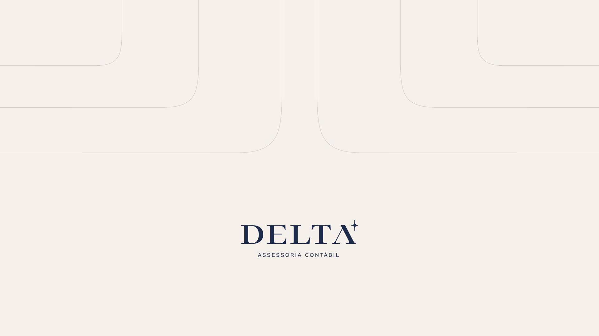
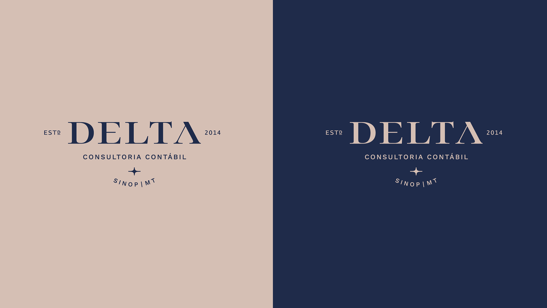
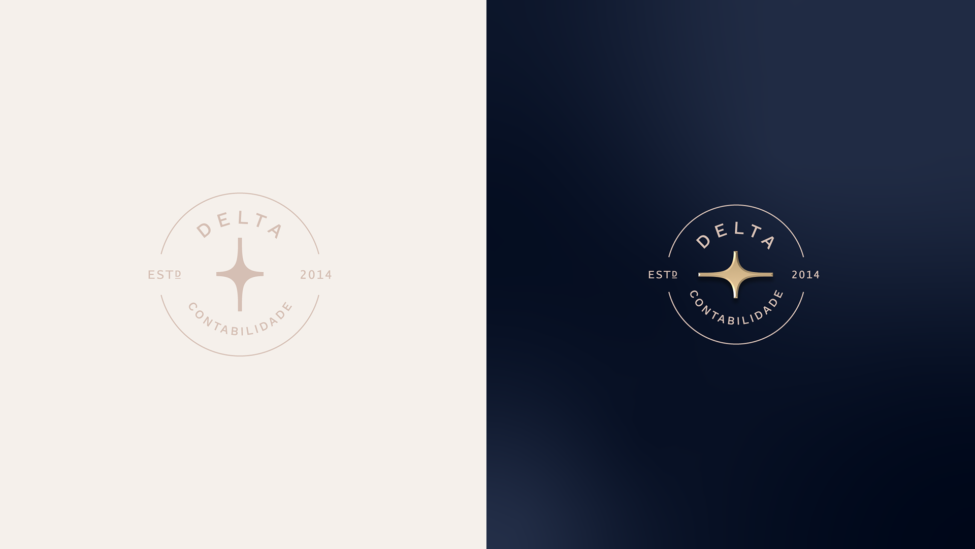
The North Star of Business We reimagined the "Delta" concept by introducing a star symbol. Just as ancient navigators used stars to find their way, Delta acts as a guide for its clients' growth. The logo features minimalist, elegant lines, balancing the seriousness of the sector with a modern, artistic touch.
Visual Elements
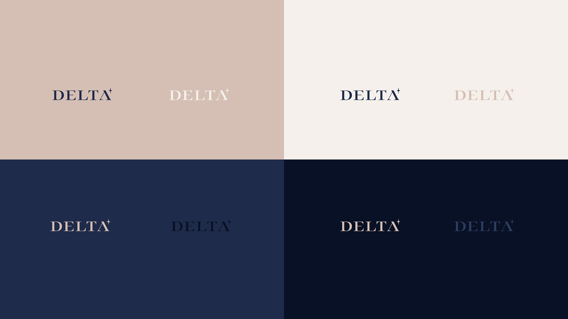
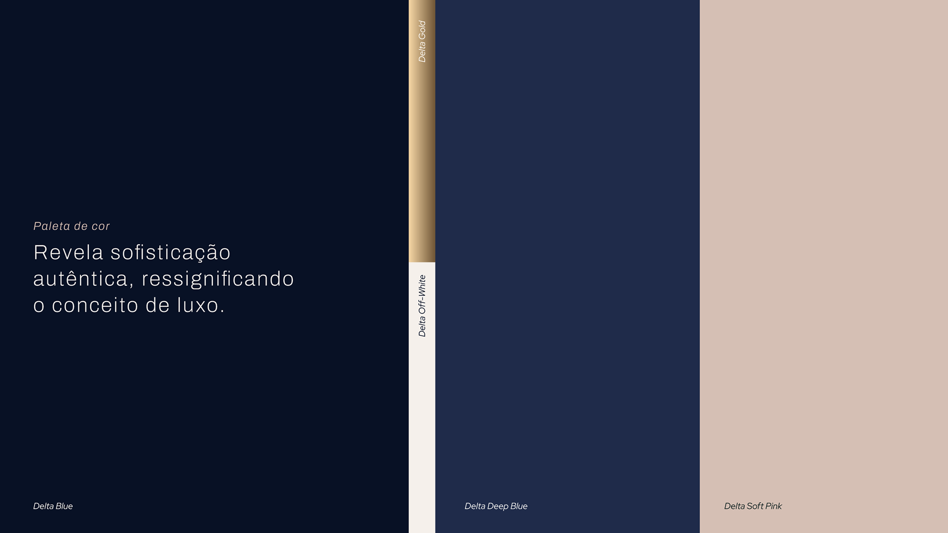
Color Palette: A sophisticated mix of Deep Blue, Soft Pink, Off-White, and Gold. This combination moves away from the "corporate blue" standard, offering a timeless and exclusive feel.
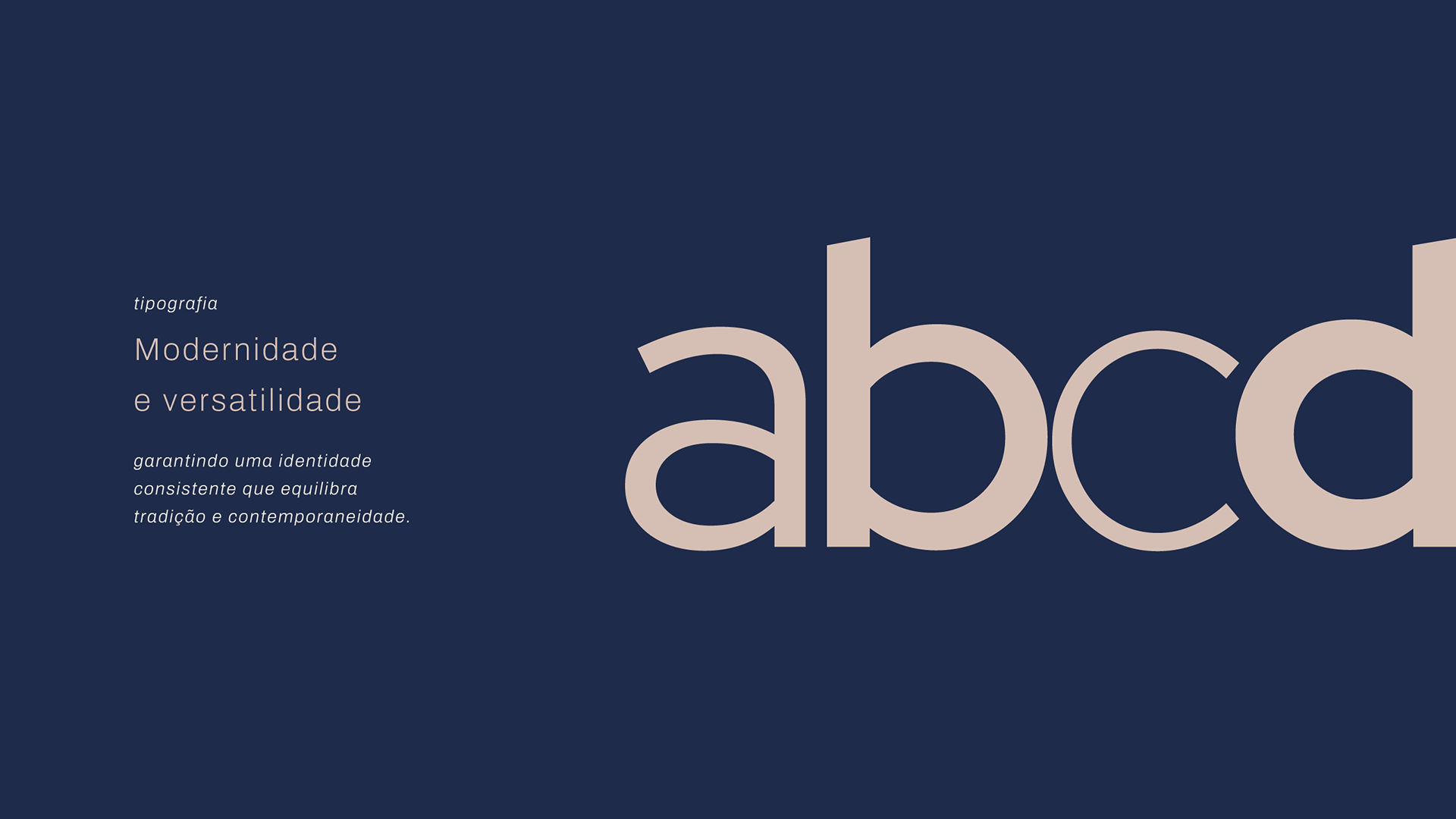
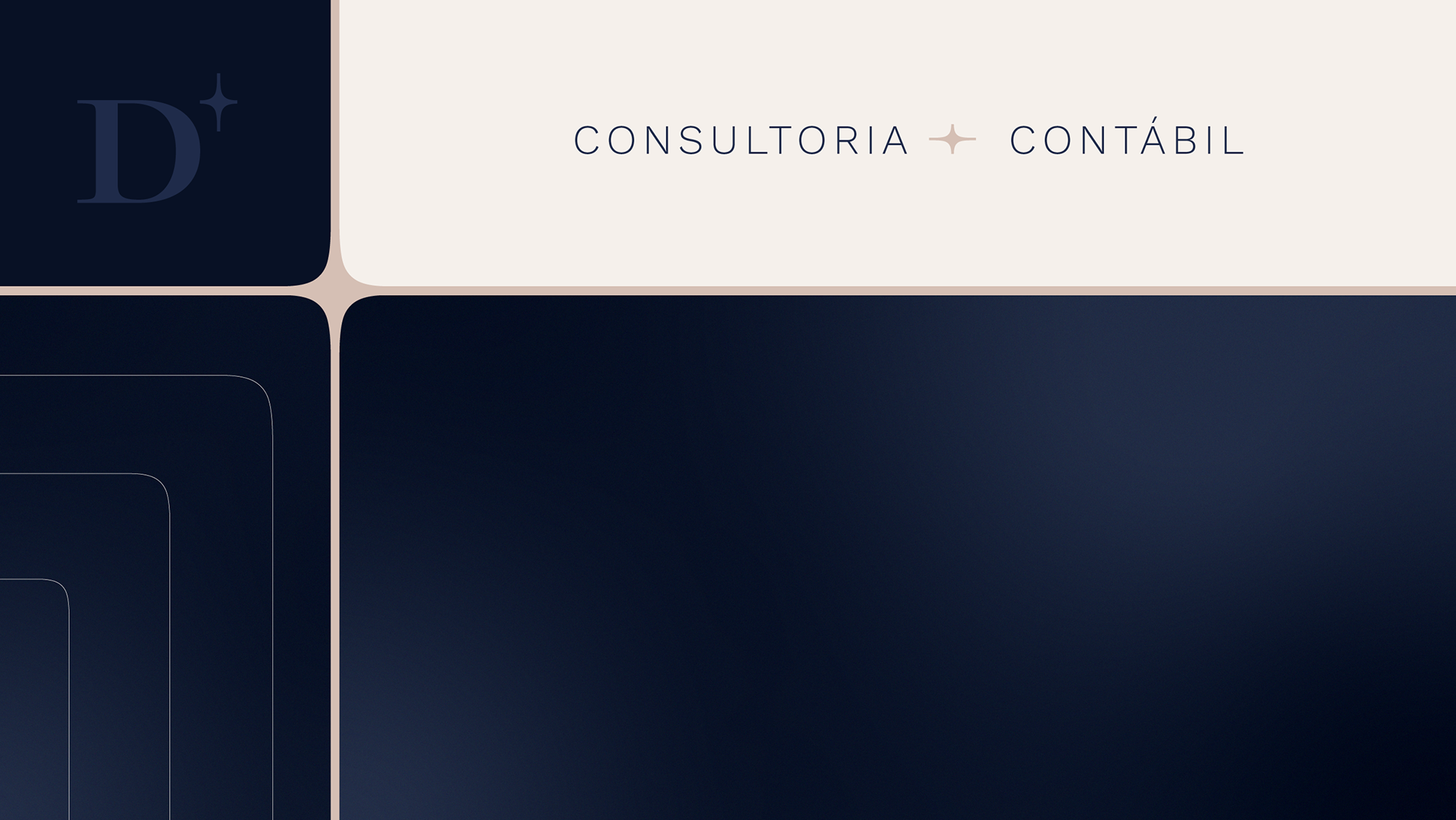
Typography: We chose Work Sans for its versatility. It creates a perfect equilibrium between traditional reliability and contemporary boldness.
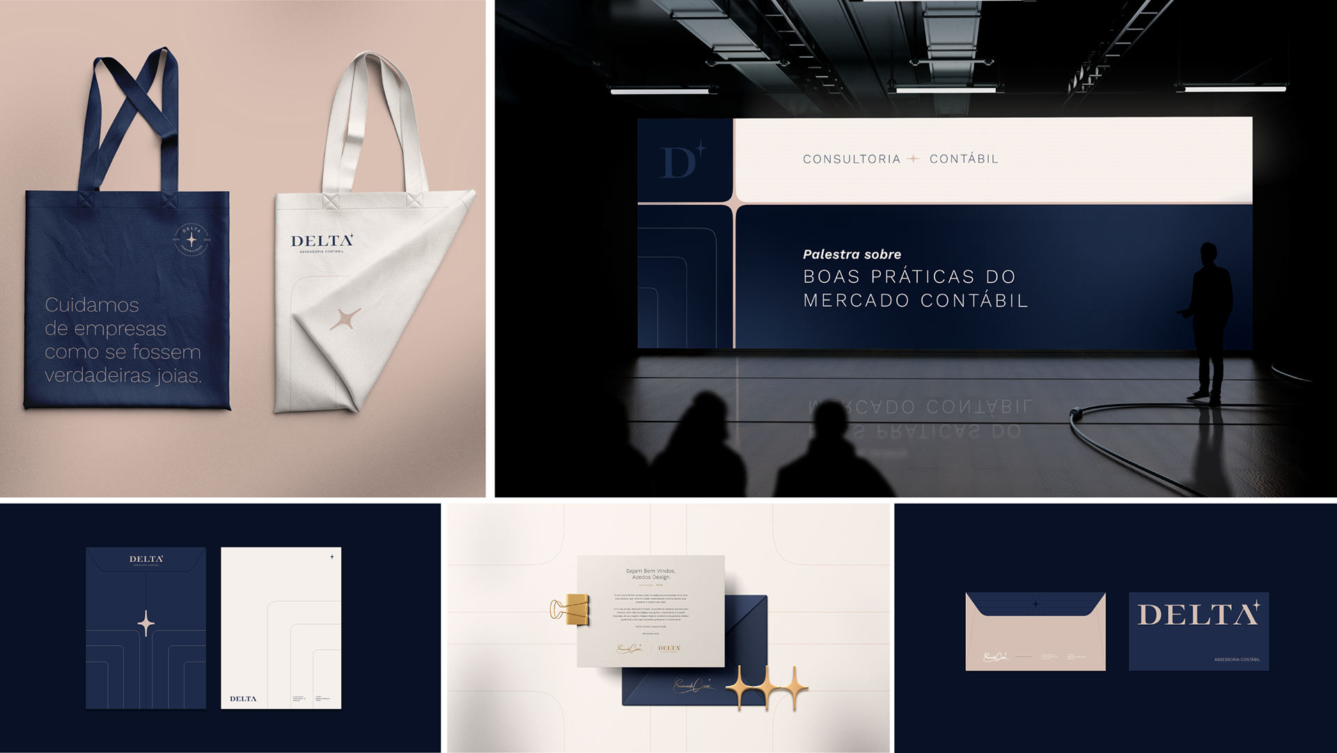
Brand Personality: Every detail was designed to mirror Manu’s leadership—authentic, sophisticated, and inspiring.
The Outcome A brand that doesn't just communicate; it belongs.
Delta Contabilidade now occupies a unique space in the market: a business with a soul, representing high-standard services and a personality-driven approach that differentiates it from any competitor.
Delta Contabilidade now occupies a unique space in the market: a business with a soul, representing high-standard services and a personality-driven approach that differentiates it from any competitor.